2012 – Bigger isn’t always better – witness the success of the iPhone and the MacBook Air – but it often is.

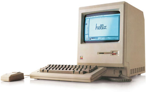
When the Macintosh was born in 1984, it had a 9″ 512 x 342 pixel display. Apple grew that with a 13″ 640 x 480 color display introduced with the Mac II in early 1987, and that would be followed by portrait, two-page, AppleVision, Cinema, and a number of other types and sizes of displays over the years, culminating in the 27″ iMac with its 2560 x 1440 pixel widescreen display. (Yes, Apple has also produced a 30″ 2560 x 1600 display, but that’s history.)
The original Mac display had 50% more horizontal pixels than vertical ones, giving it a 3:2 ratio. From that point forward, most Mac displays had a 4:3 ratio – 640 x 480, 832 x 624, 1024 x 768, etc., although Mac Portables and early PowerBooks bucked that trend with their 640 x 400 (16:10) ratio – which Apple abandoned when 640 x 480 LCD screens become more readily available and more affordable.
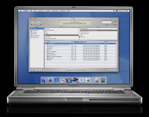
 Apple began to move away from 4:3 displays when it introduced the Titanium PowerBook G4 in January 2001 with its 15″ 1152 x 768 “megawide” display. That 3:2 ratio became the norm for 15″ and 17″ Mac notebooks, and the Mid 2002 17″ iMac brought widescreen to the desktop with its 1440 x 900 (16:10) screen.
Thanks in no small part to widescreen digital TV, things have become even more stretched out, with a 16:9 ratio becoming the norm for the iMac and Apple’s 27″ displays. Except for the iPad with its 9.7″ 1024 x 768 display, the 4:3 display is history at Apple, and the iPhone and iPod touch are the only remaining products with a 3:2 display. [This was written before the iPhone 5.] Widescreen has taken over.
Been There
I voiced my opinion of cinema widescreen displays in 2008 in a article applauded by a few and ignored by the masses (see 16:9 Computer Displays: Let’s Not Go There), and I haven’t changed my mind since then.
I have, however, had a couple widescreen displays – a 22″ 1650 x 1024 Cinema Display and a 20″ 1680 x 1050 Cinema Display. These are 16:10 displays, and since my main display had a 1280 x 1024 resolution (a 5:4 ratio), I felt comfortable with the screen height and really appreciated the extra width.
My work style is to have different applications running on the right and left sides of the display. For instance, the window I’m writing this in is on the left, and I have a browser window open on the right, which makes it easy to look things up and copy information. Wide is good, as with narrower displays (i.e., less horizontal pixels) the windows would overlap more. With 1600 to 1680 pixels of width, overlap was less of a problem.
My problem was working with three different Macs and three different monitors. On the left is my Mac OS X 10.4 Tiger machine, a Mirrored Drive Doors Power Mac G4 from 2002. On the right is my 2007 Mac mini running OS X 10.6 Snow Leopard, my only Intel Mac and the oldest Mac mini with 64-bit support. If I ever want to run OS X 10.7 Lion, I can do so on this Mac.
In the middle is my OS X 10.5 Leopard machine, a Digital Audio Power Mac G4 from 2001 with a dual 1.6 GHz processor upgrade. Due to some oddities in the way Teleport (a program that lets one keyboard and mouse control multiple Mac) works, a Leopard Mac can control a Tiger or Snow Leopard Mac just fine, but the Snow Leopard Mac cannot control a Tiger Mac properly, although Leopard is not a problem.

Three different displays side-by-side. It works, but it’s not pretty.
So I have three Macs running side-by-side, each with a different display. The Tiger Mac had the 22″ Cinema Display, the Leopard Mac (which is the least used of the three but necessary for Teleport to do its thing) had the 1280 x 1024 Dell flat panel display, and the Mac mini had the 20″ 1680 x 1050 Cinema Display.
Three screens, each with a different color profile, different brightness, different pixel sizes. It worked, but those old Apple Cinema Displays with their 2″ plastic surrounds were huge, and I couldn’t make them sit upright because of the display stands built into them.
I Went Back to 4:3
What I really wanted was three monitors sitting at the same angle and as close together as possible. When I discovered that Advance Technology Recycling had some used 20″ Dells with 1600 x 1200 resolution, the wheels began to turn. These displays had good reviews, the $75 price was very attractive, and they have a VESA mounting system, so at some point I couldmount them side-by-side using a display system. I’ve already found one on Amazon.com that seems very promising.
If you’ve read about my workspace before, you know it’s very much cobbled together, built from two 2-drawer file cabinets, four compact Mac II series computers on top of them to get the desktop – formerly our kitchen countertop – to the right height for a standup desk. On top of this are three full sized Mac II series computers that function as monitor stands, bringing the screens to a more comfortable work height. The most expensive part of the desk was the keyboard drawer, which was brought over from my previous desk.
This was originally going to be a short-term proof of concept desk, but site finances were not the best last year, so it’s stayed like this much longer than I wanted. At least I know the height works for me, and I have some ideas for when I can make things more permanent.
Anyhow, I’ve now got three more-or-less matching displays. They’re all the same model, and they’re as close to the same height as I can manage on a not-quite-flat desk, but no matter how much I fiddle with calibrating the monitors, each one has a different brightness and color cast. I guess that’s just one of the things you get to deal with when buying used monitors. (For the record, these are in excellent condition, and Advance Technology Recycling did a great job packing them up for shipping.)

Three side-by-side matching displays. Much easier to work with.
What I discovered when I switched from my old 1024 and 1050 pixel high displays to the new 1200 pixel high ones is that I absolutely love the additional vertical space. I did lose a few pixels of width compared to the two Cinema displays, but I’ll take an extra 150 pixels of height at the cost of 80 pixels of width any day. This isn’t just true for writing and browsing, but for spreadsheets as well. One of my AppleWorks spreadsheets now displays 75 rows of data, up from 59 on the old display.
Update, March 2016: I’m still using these three displays, now on a shelf above my standup desk made mostly from Ikea parts. It’s a lot prettier than it was back in 2012. The right and left displays are now oriented vertically, which is spectacular for viewing web pages. The computers are now a Late 2008 2.0 GHz MacBook with OS X 10.9 Mavericks, the same 2007 Mac mini, and a Late 2005 2.3 GHz Power Mac G5 Dual with both Tiger and Leopard installed.
As much as the world has embraced 16:9 displays for watching TV and recording video on modern video cameras, it’s just not the ideal format for a lot of other kinds of work. If you find your display is creating as many problems as it solves, maybe it’s time to look at other sizes and resolutions for getting the job done – one reason I prefer my old Power Macs and Mac mini over iMacs, which lock you into whatever display they’re built around.
Bigger can be better, but when it comes to computer displays, it has to be bigger in the right direction.
Keywords: #monitors #displays #aspectratio
Short link: http://goo.gl/k0ChN5
searchword: biggerisbetter

