There are several ways to design a portable computer. The first,
such as the Osborn and Kaypro, were suitcase-sized behemoth's with
CRTs, dual 5.25" floppies, hinged keyboards, CP/M brains, and power
cords. These soon evolved hard drives and detached keyboards.
Next came the lunchbox portables, which I believe Compaq pioneered.
These vertical machines were perhaps the first to use flat panel
displays. When in transit, the keyboard protected the computer screen.
They were a lot lighter than the earlier suitcase beasties and, just
like lunchboxes, had handles on top.
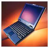
Then came the laptop, which moved the brains from behind the display
to below the keyboard and added a battery for cordless field work.
Zenith was one of the pioneers, and the overall design has remained
pretty much the same since then. Sure, we've added color, CD-ROM, and a
variety of pointing devices, but the basic design principles haven't
changed.
Macintosh
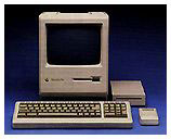
The first
Macintosh was a portable, although not quite in the suitcase
pattern or the lunchbox one. Still, it could be thrown in a bag and
toted from place to place.
By 1989 a lot of Mac users were buying DOS and Windows laptops to
supplement their Macs, so Apple introduced the Macintosh Portable, a 16 pound device
with up to 10 hours of battery life, a fast (for that era) 16 MHz
processor, 40 MB of hard drive space, and room for up to an almost
unthinkable (remember, 1989) 10 MB of RAM.
Too large, heavy, and expensive for the market, it pretty much
fizzled. It was an impressive piece of work. I still love mine. But it
tried to be the wrong thing for the market.
Apple rectified those problems in 1991 with the PowerBook 100, 140, and 170. They introduced a trackball in front
of the keyboard, which is were most of today's portables have their
touchpads. Best of all, these were compact and light, weighing
one-third to one-half as much as the Portable.
Design Goals
There are several ways to design a portable. The earliest ones just
repackaged components into a huge box. Then came the LCD breakthrough,
greatly reducing overall size. Because LCDs used a lot less power than
CRTs, it became possible to take the next step: battery power. The the
all-in-one design and Windows made it important to put a pointing
device on the computer itself.
Even then there were different design philosophies. HP thought the
laptop should emulate the desktop, so one of their early models had a
full keyboard; the computer was as big as a briefcase. Others
recognized that laptops were often supplements to desktop machines, so
they could dispense with certain features to keep the size down.
To this day every laptop tries to find the right balance between
features, performance, size, and price to meet the needs of the market.
And no single laptop can do that.
One Size Does Not Fit All
Apple has traditionally had only one or two basic models, although
there might be different processor speeds, memory configurations, and
drive sizes available. For the  most part,
Apple targets the road warrior, someone who wants most or all of a
desktop's capabilities on the go. Although the PowerBook 100, Duo
series, and 2400c were
excellent "small and light" machines, Apple didn't find it a large
enough market to stick with.
My perfect PowerBook would not be a thin-and-light design, although
that wouldn't be a bad thing. No, because of the way I work, a large
screen is paramount. Although the 1024 x 768 display in the current PowerBook is nice,
I'm used to working at 1280 x 1024. While some Windows laptops offer
screens that spacious, so far Apple has not.
There are rumors of "Mercury," a new G4-powered PowerBook with a
larger screen, perhaps even one with a cinema format. I'd like that,
with or without a G4 processor. Give me 1280 x 960 or larger with a 400
MHz or faster G3, Apple, and I'll find some way to finance it.
Here's a very brief rundown of specs for my ideal PowerBook. It may
not come close to what you want, but it is much closer to my needs than
today's "one size fits most" PowerBook.
- 1280 x 960 or larger screen. The 1600x1024 of the Cinema Display
would be incredible, but could be overkill unless pixel density is very
high.
- No more than 1.5" thick; thinner is always better
- Just 10" deep (vs. 10.4" for PowerBook) and under 14" wide (to
provide room for the bigger screen). That leaves room for a 15.8"
screen with 1/2" around the edges.
- Eliminate device bay to reduce complexity, thickness, and cost.
Instead, use a slot-loading DVD drive.
- Six hour battery life. Extra width and elimination of drive bay
hardware could create room for a larger, longer-life battery.
- Lighter than WallStreet, probably in the 6-7 pound range.
- 400 MHz or faster G3 or PPC 750CX.
- 128 MB memory, expandable to at least 512 MB.
- 6 GB is plenty of drive space for me.
- The usual: AirPort, USB, FireWire, a PC Card slot, 10/100 ethernet,
v.90 modem, etc.
And now let's add some very creative innovations: solar panels in
the lid to create current from ambient light and further increase
battery life, full-sized arrow keys, a CompactFlash card slot for
creating a nonvolatile bootable RAM Disk, an internal emergency battery
providing up to 15 minutes of power when the main battery is removed or
runs down, and a handle (as with the iBook) to simplify
transportation - but that can also be folded down to prop up the back
of the computer a bit for better ventilation and improved typing (I
know ergonomincists will disagree here, but I type better on a
conventionally tilted keyboard).
This is one way to design a PowerBook for the road warrior. It's not
the thin and light model I believe Apple should build for those
supplementing a desktop, but I think it would be an ideal desktop
replacement for a lot of user who find the current PowerBook offers
just a bit less screen real estate than they really need.


 most part,
Apple targets the road warrior, someone who wants most or all of a
desktop's capabilities on the go. Although the PowerBook 100, Duo
series, and
