"You collect old Macs? What's the big attraction?"
It's a question I've heard enough times that I've been forced tothink over my answer. I mean, the actual guts of the hardware isn't thereason. Having computers that don't have Intel Inside gives me a warm,squishy, stick-up-for-the-underdog feeling, but that isn't enough.
It's not just the operating system, either. I mean, even if I couldrun OS 8 on a Dell Pentium, I don't think I'd have an attic fullof the things. There's got to be more to it than just a Motorola chip,a smiley Mac, and startup chime.
I think it comes down to the fact that they just feel better bydesign - better in a bunch of ways that are hard to quantify.
Consistency
The first way is the most prosaic and, in many ways, the one that'shardest to hold against the Mac's Wintel rivals. I love the consistencyof so many hardware features on the Mac. Unlike the PC world, Macs aremade by one company and make use of very little in the way ofthird-party hardware, and so it was easy for Apple to set standards inthings like ports and the marking of those ports - and to stick tothose standards.
From my oldest Mac almost to my newest, there's a remarkable amountof continuity in simple things like "this is a modem connection, andthis is how it's labeled". By comparison, I have Wintel boxes builtonly a couple of years apart that have nothing in common on the backsides but the power socket and the VGA port. No wonder there were nearriots in the Mac world with the disappearance of SCSI and ADB!
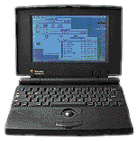 Another area where Macs shineis in the area of clever little design details. Look at the first PowerBooks: They weren't the firstlaptop computers, but they were the first to move the keyboard towardsthe rear of the case. It seems such a simple thing, but prior to that,there was no place to rest your palms while typing on a notebook.
Or consider the back of the case on a PowerBook Duo. Flanking the little "garagedoor" that retracts into the housing to uncover the port for the dockare two sturdy feet. The feet pivot downwards, and the pivots areclearly marked with the standard Mac symbols for a modem and a printerport. Sure enough, if you pivot the feet downward, the respective portsare uncovered.
Maybe the best known piece of clever Mac design gadgetry dates backto the very earliest Macintoshes. In addition to using radical newcompact 3.5" floppy disks, there was no "eject" button on the face ofthe machine. Instead, a powered servo would whine when you dragged thepicture of the disc on the desktop to the picture of a trash can, andthe computer would politely extrude the ejected disc. If that didn'tset your gadget bells to ringing, may I suggest stamp collecting as asoothing alternative hobby?
Clever Solutions
Indeed, the history of the Macintosh is practically the history ofclever little computer design solutions. Hot-swappable device bays.Internal wireless networking. From power buttons on the keyboard totrackpads, from stereo speakers in laptop lids to folding carry handlesin laptops, Apple has taken clever solutions to everyday computingproblems to an art form. One could nearly write a term paper on Macnotebook power supplies and their various clever ways of managing powercords alone.
Simply Good Design
However, more important than either good design in ports and theirlabeling or good design in the form of gee-whiz hardware details isgood design overall.
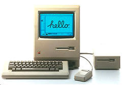 With the dawn of the original Macintosh, itwas obvious that here was Something Different. It wasn't just theall-in-one form factor of CPU/monitor/disk drive; that had been donebefore by companies as varied as Commodore and Radio Shack. This time,though, it was done by a company to whom good design obviouslymattered.
Good design is one of those things that reminds one of Supreme CourtJustice Stewart's descriptor of pornography: You can't define it, butyou know it when you see it. The Mac splashed into a world full ofconsumer electronics that were still slathered in brushed chrome andwoodgrain stickers like a dinosaur-killing asteroid into the Gulf ofMexico.
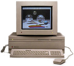 Perhaps themost telling metric of how important the "House of Style" theme was tothe Mac was how painfully apparent its absence was during the dark daysof the mid 1990s. Early Macs, with the painful exception of theMac II, were possessed of the crisplines and smooth radii more associated with German sedans and Italiancouture than with desktop nerdboxes. It's no wonder that designers andthe people who write software for them flocked to the platform!
It may be heretical to say as much, but I'd almost be willing towager that frog designstyle had as much to do with the embrace of the Mac by the artsyset as the point-and-click interface.
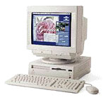
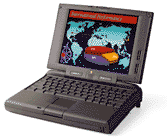 It may be no coincidence that theplummeting fortunes of Apple coincided with the era of "me too" beigeboxes - like the Performa 630and dull charcoal bricks like the PowerBook 190 - and that its resurgencebegan with the introduction of the brightly colored jellybean iMac, the curvaceous WallStreet, and the radicalB&W G3.
Why do I love old Macs?
Because they're better - by design. 

 Another area where Macs shineis in the area of clever little design details. Look at
  With the dawn of
  Perhaps themost telling metric of how important the "House of Style" theme was tothe Mac was how painfully apparent its absence was during the dark daysof the mid 1990s. Early Macs, with the painful exception of the
 It may be no coincidence that theplummeting fortunes of Apple coincided with the era of "me too" beigeboxes - like the
