Attractive/Ugly Macs
From Scott:
Thank for writing the article about the attractiveness of
Macs! I've been waiting for something like this for a while now,
especially because I'm particular about the appearance of the Macs I
use and/or appreciate!
A few comments I had while reading it:
- I still use an SE on a
regular basis and am glad to see it as one of the most attractive! I'm
also glad to see the MacBook
up there. Do you prefer white or black (or the new aluminum
scheme)?
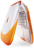 The "interesting, yet not really
pretty" label on the clamshell
seems to be a gender preference. Girls have told me the my clamshell
(which is tangerine) is "pretty", while guys have said it's "cool
because it's orange". (I bought it because orange has always been my
favorite color.)
The "interesting, yet not really
pretty" label on the clamshell
seems to be a gender preference. Girls have told me the my clamshell
(which is tangerine) is "pretty", while guys have said it's "cool
because it's orange". (I bought it because orange has always been my
favorite color.)- I beg to differ on a few models. I find the Mac Pro/Power Mac G5 to be hideous! I think
it looks like a cheese grater! Also, I would say the original pizza box
LCs look infinitely better when you put the 12" monitor that matches
them on top - I always think of my LC as a "big compact" with its 12"
monitor (perhaps because it has a similar resolution to the 9"
screens). I also noticed my PowerBook
170 listed as an ugly Mac! I don't think it's that bad, but it
probably is the ugliest Mac I have (compared to the SE, LC, Clamshell,
and Black MacBook, not to mention the Classic sitting in my
closet).
- I noticed the IIsi and
Power Mac 4400
weren't on the list. I'm guessing the IIsi is lumped in with the LCs on
your list (since it looks like a tall LC), but I'm curious to hear what
you think of the 4400. I think it looks sort of cool myself, but a lot
of people have said it's the ugliest Mac Apple has ever released. The
eMac also wasn't there
- I'm guessing it's on par with the iMac, or does the white plastic and
large speaker design put it down lower in your book?
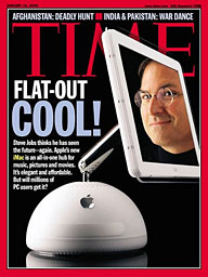 I personally find the iMac G4 the most attractive
of all the Macs ever produced. I'll never forget picking up Time
magazine when it came out! I gave mine to my mother two years ago when
I went completely mobile but still get to check in on it now and
then.
Thanks again for writing an article about the attractiveness of
Macs!
Scott
Hi Scott,
My pleasure.
Were singing from the same hymnbook on most
points.
I like the look of the clamshell iBook, and tangerine
is my second-favorite color after Key Lime, but I stand by my
characterization. It's attractive - but just too funky-looking to call
beautiful.
The Power Mac was one I equivocated about placing, and
perhaps I did put it higher in the pecking order than was
justified.
Bang-on point about the LC with the 12" monitor.
Remember when a 14" CRT was a "big monitor?" I really didn't like the
styling of the PowerBook 140 through 180 though.
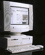 I have
to agree with your cited friends about the PM 4400 (right) I'm afraid,
but we're more or less on the same page with respect to the G4 iMac. I
don't think it's the most beautiful Mac ever, but it's my favorite iMac
for looks.
Charles
Good, Bad, and Aesthetically Challenged
From Matthew:
G'day there Charles,
I have just read your latest ramble, and, as always, it is superbly
written and incisive. I would agree with most of your categorisations.
The only Mac categorization I disagree with is the Mac Color Classic. You
placed it in the "Interesting but Not Really Pretty or Elegant"
category.
I used to own
one (back in '99) and found it to be the ugliest Mac I had ever owned.
It is true that one man's meat is another man's poison, but of all my
friends, family, acquaintances, and odious strangers that dared clump
their feet past my threshold, all of them either grimaced or grunted at
the thing in disgust.
It was easy to understand why. The poor thing (to my mind anyhow)
always seemed to want to be a beautiful, original 1984 chassis all in
one Mac but could never summon the enthusiasm. It's oddly proportioned
screen, ungainly weight-to-size ratio, and mutated front bezel sadly
cast its sickly spell over me. It's odd that of all the Macs I have
sold to people over the years, I cannot remember what happened to the
Color Classic. Every other Mac I can account for. It's funny, but to
this day I still have dreams of a classic first generation gestalt Mac
having a colour screen, something that will, unfortunately, remain
unfulfilled.
Once again, please let me reiterate, Charles, that your judgments
and subsequent categorisations of the aesthetic qualities of various
Macs over the years was pretty well spot on. Like you, I love my
Pismo, despite its
increasing age and lack of a G4 upgrade.
Please keep up the great work, take care and God bless,
Matthew
Beerburrum, Queensland, Australia
Hi Matthew,
 Thanks for your comments.
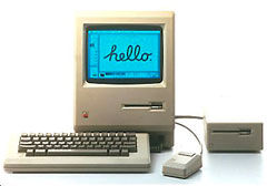
Re: the Color Classic, you're absolutely right that
it's an ugly duckling compared to the beautiful original compact Macs, But
I'm a sucker for small computers, and notwithstanding its odd styling,
I was moderately charmed by the Color Classic.
Now my LC 520 -
styled by the same designer if my recollection serves me - there was a
homely computer!
I wonder if anyone has seriously thought of grafting a
9" TFT display from a PC netbook into a classic compact Mac
case....
Charles
Great Article on Good, Bad, and Ugly Macs
From Peter:
Hi Charles,
Great article on the Good, Bad, and Ugly Designs of the Mac. I
noticed some interesting choices in each of the categories. In the
Attractive/Elegant category, you listed the Quadra 605 and Performa/Power Mac 6100 series,
but then listed every other beige model in the Boring category. What
stands out about the 605 and 6100, besides being an LC with four legs
and an oversized pizza box?
Here is another for the ugly category: the 3rd Generation white iPod
with dock connector. The four navigation controls moved off the touch
wheel was such a dumb design.
Personally, I think the Cube G4 was the most boring
design. A gray box with an Apple logo. It was an overgrown Mac mini. I
have one on my desk, but it is a Kleenex Box. Why do you consider the
20th Anniversary Mac
to be one of the ugliest? That was one of the most impressive designs
and ultimately led to the current iMac design with the components
mounted behind the LCD. Both the Cube and TAM are elegant designs, but
the TAM was a better looking Mac, something out of the future. The same
goes for the PowerBook 1xx series. The design of that laptop changed
the industry forever, compared to the PC counterparts made at the
time.
I agree that the ugliest Mac would be the All-in-One Power Mac G3. That
was the most bizarre looking computer. At least the LC 5xx series had
some character to the case. The All-in-One G3 looked like it was
swollen at the top and it would pop. Here is another "beauty" for the
ugly list: the Power Mac 4400 using the cheap PC case.
I think the PowerBook 500
series should be in the elegant category. The curves of that design
made it stand out, whereas the 5300 series returned to a more dull
rectangle.
I loved my black PowerBook G3 WallStreet II.
The Titanium G4
PowerBook was an impressive design coming off the G3s. However, the
Aluminum PowerBook G4 and initial MacBook Pro models were a boring spin
off. I have not seen the new MacBook/Pro model yet, but I think that is
considered the most impressive design for a laptop yet.
The best looking compact Mac has to be the SE/30. I love the description of the
SE/30. "Essentially a Mac IIx in a compact case, but Apple couldn't
call it the Mac SEx." The Mac
IIcx/ci would have to be the
best looking in the beige category.
I also loved my Mac Centris
650. Although it was a boring case, it was rock solid, and the case
was extremely reliable, made of metal. No vibrations at all. When I got
my Power Mac G3 Beige
desktop, I had to do some custom noise dampening to keep the
plastic parts from vibrating whenever the 24x CD kicked in. However, it
offered great expansion for a desktop design.
 And you can't
forget the black Macintosh TV with
the Beige CD Caddy door, since Apple did not want to spend money on
black-bezel CD units.
Anyway, it was fun reading your article, and you pretty much nailed
it for most choices.
Peter
Hi Peter,
We seem to agree on a fair bit, but then part company
on some styling motifs.
I liked the pizza boxiness of the 61xx series and
605.
The Cube/TAM seem to be a particularly sharp point of
divergence. I owned a Cube for a while in 2001 and loved its
aesthetics, at least without the peripherals hooked up, but I was
repelled by the look of the TAM initially and never warmed to it.
I was quite smitten with the styling of the 500 Series
PowerBook initially but grew tired of it (one of my kids had a 520).
OTOH, I liked the 5300's looks from the get-go and grew more fond of it
with exposure during the years it was my workhorse.
I prefer the look of the aluminum PowerBooks to the
TiBook, but am not in love with either. Still reserving judgment on the
new ones, but I think I like them.
Agreed on the SE/30 and you're right about the 4400 as
well.
iPods aren't Macs, but another ugly duckling iPod is
the 3G nano.
Charles
Pretty Macs
From Marion:
You missed one of my favorite Macs: the Twentieth Anniversary Mac.
The first time I saw the photos of it, it took my breath away. It is
elegant and at the time was certainly "forward looking". I believe it
stands the test of time. Granted, it was never in wide release, but
that doesn't negate its high style. It might be true that at the
original price, it should have had more power, but that doesn't negate
its high style either.
Otherwise, you've really come pretty close to picking the right
models.
Marion
Hi Marion,
Glad we see eye to eye on most models, but for some
reason, we part company rather radically on the Twentieth Anniversary
Mac, which I always thought looked ungainly and ungraceful - and wasn't
up to much performance-wise either.
However, there are no "wrong" preferences in
aesthetics. Whatever looks beautiful to the beholder.
Charles
The Good, the Bad, and the Ugly of Apple
Design
From Chuck:
Hey, here is my 2 cents.
- Sort of surprised by the difference between the Quadra 605 and the
LCI/II/III. While the exterior were different, the differences were so
inconsequential to be considered trivial. Both were pizza boxes. I
thought there were innovative, but I would have lumped them all
together.
- What about the Newton? Love it or hate it, I would have expected on
the list somewhere (I would put it as Attractive and Elegant)
- I think the iMac G5 and
the Intel iMac are at best Mediocre. The CD/DVD access out the
side for a machine that is intended for use on a desktop is dumb and
overly restrictive. The ports in the rear are hanging up in the air, if
you use several ports you end up with a rat's nest that looks plain
ugly. Several other manufactured have followed this approach, but it is
still bad.
- What about the Mac
Portable, both innovative and ugly.
Chuck
Hi Chuck,
I think my recollection may have been faulty regards
the Quadra 605 - LC I/II/III distinction.
I agree with you about the Newton's looks, but it was
not a Mac. The Newton eMate would charitably go in the Mediocre
category.
You make a solid point about the cable issue with the
recent iMacs, but I still like the looks of the glass and aluminum iMac
when the ports aren't occupied.
About the Mac Portable - agreed.
Charles
Unibody MacBook vs. Discontinued MacBook Pro
From Dan Knight in response to New Unibody MacBook or
Discontinued 15" MacBook Pro?
Charles,
We all have our own work styles. Much as I like the size of the
13.3" MacBook, I need a higher resolution display. My choice would be
the 15" MacBook Pro with its 1440 x 900 display. With the refurbished
15" 2.4 GHz
Penryn model selling for just $50 more than the new 2.0 GHz Unibody
MacBook, I'd say it's a no brainer.
In addition to the larger display, 20% faster CPU, and all those
extra ports, you also have the option of getting a matte display, which
is still my preference.
Dan
Hi Dan,
We seem to be pretty much on the same page here.
Basically, what you said. I've gotten too used to 1440
x 900 resolution on my 17" PowerBook to be sanguine about going back to
lower res for production work.
Charles
Writing with TextEdit
From Dan Palka:
I'm sure any Low End Mac user will appreciate my latest article on
using TextEdit to it's fullest potential:
TextEdit: My First Choice for Everyday Word Processing
Dan Palka
http://www.info-mac.org
Hi Dan,
Nice article.
I'm a Tex-Edit Plus
devotee myself, but TextEdit certainly has its virtues, and the price
can't be argued with for OS X users.
Thanks for the link.
Charles
Editor's note: TextEdit can also be used to open .doc,
.rtf, and .txt files and then save them as HTML files - or you can cut
and paste text into TextEdit from almost any source and do the same
thing. It's very rudimentary (you can't even add links), but it
produces much cleaner HTML (or XHTML) than exporting to HTML from Word,
Pages, and most other apps. See Convert
Formatted Text to Valid HTML Using TextEdit on Mac OS X Hints
for a lot more details. dk
Go to Charles Moore's Mailbag index.

 The "interesting, yet not really
pretty" label on
  I personally find the
  I have
to agree with your cited friends about the PM 4400 (right) I'm afraid,
but we're more or less on the same page with respect to the G4 iMac. I
don't think it's the most beautiful Mac ever, but it's my favorite iMac
for looks.
 Thanks for your comments.
 And you can't
forget the black
