The new 'Books raise the bar again for tasteful and timeless style
in laptop computers - as Mac portables have more often than not over
the past 19 years. (For a gallery of representative samples, check out
the retrospective gallery posted this week by Fortune's Apple 2.0
columnist Philip Elmer-DeWitt.)
However, Apple's design office hasn't always batted 1.000.
The Ugliest Macs
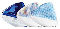
If you're a Mac veteran, you may recall (however much you've
possibly tried to forget) the unfortunate Flower Power and Blue Dalmatian G3 iMacs from
2001, which were arguably most bizarre lapse in Apple's usually (but
not always) impeccable elegance in styling and design.
"What were they thinking?" I wrote in February 2001, noting that it
was past midnight when I checked Apple's website for news of product
introductions at Macworld Expo Tokyo and was jolted wide awake by the
new iMac's livery, commenting:
"At that time of night, out here in the boonies,
silent except for the Northwest wind whistling around the eaves, a
sense of the surreal tends to set in, so the fact that I was confronted
with what looked like one snow iMac that someone had stuck an
appliqué of flower patterned MacTac over, and another that
appeared to be suffering from some sort of dread skin disease,
registered in the way such incongruities do when in a dream state."
Even at night, the Blue Dalmatian model struck me as especially
ugly.
I went back to Apple's website the next morning to make sure it
hadn't been a nightmare. It wasn't. There they were.
I called my wife to have a look. She loves floral patterns, so I
thought that she would be a likely candidate to give a stamp of
approval to at least the Flower Power machine (if anyone was). She
didn't think it was utterly horrible, but she wasn't overly
enthusiastic either, and with no coaching from me also came up with the
analogy that it looked like flowered MacTac.
Actually, the patterns were embedded in the plastic, and the
patterns did turn out look considerably better on the actual machines
than they did in pictures, but I still think that the spotted iMac
looked like it had an illness you wouldn't want to catch, and that
Flower Power resembled something one might have found painted on a
Volkswagen microbus thirty years earlier.
Volkswagen Detour
Speaking of which, VW is shamelessly exploiting boomer nostalgia for
the old VW van with a TV ad campaign here in Canada for its new 2009
Routan minivan. It's
cleverly done, but a bit over-the-top with the "German engineering"
brag when the Routan is based on Chrysler's minivan, uses Chrysler's
4.0 litre V6 engine and six-speed manumatic transmission, and is built
in the same Chrysler plant in Windsor, Ontario. It's doubtless a vastly
better vehicle than the old VW transporter/microbus was back in the
60s. I spent a fair bit of time in VW vans back in the day, and they
had their virtues, but a lot of vices as well, such as anemic power,
dodgy road holding, especially in crosswinds, and dismaying tendency to
catch fire. Pardon the digression.
Back to Apple styling: Macworld referred to the Flower Power iMac as
"Pokemon Vomit". MacMonkey's David Egger entitled his commentary on
these units,
"Honey did you puke on the iMac?" The MacMind's Dean Browell
observed: "I swear to you when I saw the iMac collage of Graphite,
Flower Power and Blue Dalmatian colors I thought it was a joke site.
Damn these things look like a Swatch Watch threw up."
One distraught Mac writer agonized:
"The new iMacs are horrible. It's a complete disaster.
Apple is finished. I am not going to say anything for as long as I can,
hopefully forever. Once I start saying what I really think about the
new iMac colors, I'll never stop. The press tomorrow will be
unmerciful, of course. Apple is finished. It's the end of an era. You
can't even run OS X on the new machines without adding RAM
yourself. What a joke. "
Well, it didn't turn out to be nearly that bad. Apple discontinued
the Flower Power and Blue Dalmatian six months later - after
understandably poor sales - and the iPod intro was just eight months in
the future, but there did seem to have been a lapse of judgment (even
sanity) at Apple.
Surrounded by Good Design
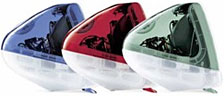 The "earth tone"
iMacs (indigo, sage, ruby, and snow), introduced in July 2000, had
been up to the high water mark of good taste in iMac styling, The
original Bondi blue
iMacs were subdued and reasonably attractive, althoguh I didn't
really care for teal.
The "earth tone"
iMacs (indigo, sage, ruby, and snow), introduced in July 2000, had
been up to the high water mark of good taste in iMac styling, The
original Bondi blue
iMacs were subdued and reasonably attractive, althoguh I didn't
really care for teal. 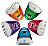 I didn't particularly like the fruit colored models
introduced in January 1999 either - they always seemed bit frivolous
and loud. On the other hand, I really liked the snow and sage iMac
models.
I didn't particularly like the fruit colored models
introduced in January 1999 either - they always seemed bit frivolous
and loud. On the other hand, I really liked the snow and sage iMac
models.
At least the popular indigo and Apple's signature graphite colors
were still available as respectable alternatives to Hippie Dippy and
Cruella de Vil - and outsold them handily.
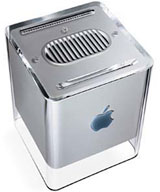 What caused
Apple to drop the ball so stunningly is an enduring conundrum, the
cause of considerable befuddlement as to how the same styling
department could turn out something as understatedly elegant as the
contemporaneous G4 Cube
and as overstatedly hideous as the "Flower Power" and "Blue Dalmatian"
iMacs inside of a six month period. Apple's style sense has typically
been the best in the industry, and while Flower Power and Blue
Dalmatian were a worst-case slip, it's not to say that Apple has not
made other styling missteps from time to time.
What caused
Apple to drop the ball so stunningly is an enduring conundrum, the
cause of considerable befuddlement as to how the same styling
department could turn out something as understatedly elegant as the
contemporaneous G4 Cube
and as overstatedly hideous as the "Flower Power" and "Blue Dalmatian"
iMacs inside of a six month period. Apple's style sense has typically
been the best in the industry, and while Flower Power and Blue
Dalmatian were a worst-case slip, it's not to say that Apple has not
made other styling missteps from time to time.
Style
Style is, of course, a tricky thing to critique, because it is
always to some degree a matter of subjective taste, and there are few
purposely styled objects that cannot claim a least a few aficionados,
be it only the stylist and his or her mother.
However, I believe that there is such a thing as objectively good or
bad taste, elitist as that may sound to some 21st century ears. For
example, I would vigorously contend that Beethoven's Ninth Symphony is
a much more tasteful work than Elvis Presley's "You Ain't Nothin' But a
Hound Dog", both aesthetically and on the basis of its musical depth
and complexity.
Taste must also be appropriate to context. For example, Beethoven's
Ninth would not be a sensible choice for the playlist at a bachelor
party or beer bash, while Hound Dog or other popular ditties of the
same genre would be entirely suitable.
In terms of style, and focusing in more closely on the central theme
of this discussion, it would be bad taste to paint, say, a Bentley
Brooklands bright canary yellow, but that color suited to a T a 1968
Dodge Super Bee a friend of mine used to own. Context, as I said, is
key.
And so it was with the Flower Power and Blue Dalmatian iMacs. Right
now, by happenstance, I am looking at one of our family's towels, which
has a flowered print motif not unlike that of the Flower Power iMac. It
is a very attractive towel, one of my favorites, in fact, but I
wouldn't want that print decorating my computer.
Historically, I would divide Apple styling into four categories:
- Attractive and/or elegant
- Interesting, but not really pretty or elegant
- Mediocre/boring - they can't really have been trying
- Ugleee!
There have been too many Apple models over the past 21 years to do
an exhaustive breakdown, but here are what I consider the most notable
examples.
 1. Attractive and/or Elegant
 2.
Interesting, but Not Really Pretty or Elegant
2.
Interesting, but Not Really Pretty or Elegant
 3.
Mediocre/Boring/Ungainly
3.
Mediocre/Boring/Ungainly
4. Ugleee!
I expect there are many who will disagree with my categorizations,
but that's the way I see it. Not to say that the homelier ones were or
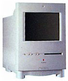
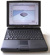
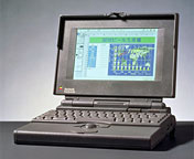
are necessarily bad computers functionally. My awkward-looking Mac LC 520 served me well as a faithful
workhorse.
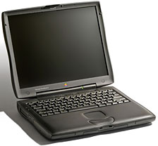 If you're a regular Low End Mac reader, you know I'm a
consummate fan of the G3 Series PowerBooks, especially the Pismo, but
I've never been especially smitten by their styling - their
charcoal-black color, Coke-bottle waisted cases, lozenge-shaped
trackpad buttons, and rubbery-plastic appliqué on the outer
contact surfaces. I prefer the slimmer Lombard and Pismo to the hulking
WallStreet looks-wise. The latter did have the advantage of two PC Card
slots and more versatile dual expansion bays, however.
If you're a regular Low End Mac reader, you know I'm a
consummate fan of the G3 Series PowerBooks, especially the Pismo, but
I've never been especially smitten by their styling - their
charcoal-black color, Coke-bottle waisted cases, lozenge-shaped
trackpad buttons, and rubbery-plastic appliqué on the outer
contact surfaces. I prefer the slimmer Lombard and Pismo to the hulking
WallStreet looks-wise. The latter did have the advantage of two PC Card
slots and more versatile dual expansion bays, however.
The dual-USB iBooks, metal PowerBooks and MacBook Pros, and the
MacBook are all much better-looking, although not functionally superior
with their slim to razor-thin cases.
 Interestingly, proportion can have a lot to do with it. The
PowerBook 5300/190 and the 12" iBook have roughly the same footprint
and length-depth dimensions, and I've always found both pleasing to my
eye. On the other hand, the PowerBook 3400c/3500c models used
essentially the PowerBook 5300 styling and even some of the same
plastics, but stretched the depth to accommodate a CD-ROM drive while
adding a bulge to the lid to fit in a "subwoofer" speaker. The
3400/3500 were excellent computers - vastly better than the 5300 - but
they were ugly ducklings.
Interestingly, proportion can have a lot to do with it. The
PowerBook 5300/190 and the 12" iBook have roughly the same footprint
and length-depth dimensions, and I've always found both pleasing to my
eye. On the other hand, the PowerBook 3400c/3500c models used
essentially the PowerBook 5300 styling and even some of the same
plastics, but stretched the depth to accommodate a CD-ROM drive while
adding a bulge to the lid to fit in a "subwoofer" speaker. The
3400/3500 were excellent computers - vastly better than the 5300 - but
they were ugly ducklings.
Pretty much the same applied to the two sizes of dual-USB iBook. The
original 12" dual USB iBook was elegant and beautifully proportioned.
Stretching the same styling to accommodate a 14" display made it
mediocre-looking at best.
On the other hand, the aluminum PowerBook/MacBook Pro design has
proved to be quite successfully adaptable to resizing, and I think all
four form factors (six if you separate the slightly deeper MacBook Pros
from the PowerBooks) look elegant and attractive.
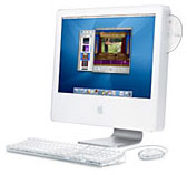 Sometimes
materials and livery can make the difference. I always thought the G5
iMac/early Intel iMac was ungainly looking in white plastic (and I
usually like white computers) due to the disproportionate expanse of
white "chin" area below the display. However, the newer aluminum iMacs
- which have pretty much the same basic styling but in an aluminum
housing and with a glass cover over the display and other iPhone-esque
styling cues - looks positively fetching to my sense of aesthetics.
Sometimes
materials and livery can make the difference. I always thought the G5
iMac/early Intel iMac was ungainly looking in white plastic (and I
usually like white computers) due to the disproportionate expanse of
white "chin" area below the display. However, the newer aluminum iMacs
- which have pretty much the same basic styling but in an aluminum
housing and with a glass cover over the display and other iPhone-esque
styling cues - looks positively fetching to my sense of aesthetics.
At least that's my taste. Yours may differ, and I'd be interested in
hearing your Apple product styling critiques in the Miscellaneous
Ramblings Mailbag.
Follow up in the Miscellaneous Ramblings Mailbag
 iMac Flower
Power and Blue Dalmatian
iMac Flower
Power and Blue Dalmatian
