Miscellaneous Ramblings
Taste, Style, and the Mac
Charles W. Moore - 2001.04.13
Style is a tricky thing to critique, because it is always tosome degree in matter of taste, and there are few purposely styledobjects that cannot claim a least a few aficionados, be it only thestylist and his or her mother.
However, I believe that there is such a thing as objectivelygood or bad taste, elitist as that may sound to some 21st centuryears. For example, I would vigorously contend that Beethoven'sNinth Symphony is a much more tasteful work than Elvis Presley's"You Ain't Nothin' But A Hound Dog," both aesthetically and on thebasis of its musical depth and complexity.
But it's still a tricky concept, and taste must also beinappropriate to context. Beethoven's Ninth would not be, forexample, a sensible choice for the playlist at a bachelor party orbeer bash, while Hound Dog or other popular ditties of the samegenre would be entirely suitable.
In terms of style, and focusing in more closely on the centraltheme of this discussion, it would be bad taste to paint a newBentley Arnage bright canary yellow, but that color suited a '69Dodge Super Bee a friend of mine used to own perfectly. Context, asI said, is key.
Now this column really is about Macs, specifically my ongoingbefuddlement as to how the same styling Department could turn that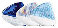 something as understatedly elegant as the G4 Cube, and as overstatedly bizarre asthe "Flower Power" and "Blue Dalmatian" iMacs inside of a six monthperiod.
As I said, context is key. Right now, by happenstance, I amlooking at one of our family's towels, which has a flowered printmotif not unlike that of the Flower Power iMac. It is a veryattractive towel, one of my favorites, in fact, but I would notwant that print decorating my computer.
One of the things that makes the Mac orbit interesting, I guess,is that you really never know what Apple will do next, butpersonally, I would prefer a bit more adherence to a recognizabletheme, styling wise - a sort of recognizable signature look acrossthe line - so long as they slotted settled on the right one.
For instance, IBM computers have a particular look - desktop orThinkPad - that gives an immediately recognizable sense ofcoherence.
By comparison, if you take Apple's current five computer modelfamilies, aside from colors shared by some models, there is reallyno thematic coherence at all. An iMac looks nothing like a PowerMaclooks nothing like a Cube looks nothing like an iBook looks nothinglike a PowerBook. Distinctiveness is one thing, but this ischaos.
This state of affairs is not new, but it has never been asextreme as it is now.
Historically, I would rate Apple Computer styling in fourcategories:
- Attractive and/or elegant
- Interesting, but not really pretty or elegant
- Mediocre/boring - they can't really have been trying
- Ugleee!
There have been too many Mac models over the past 17 years to doan exhaustive breakdown, but here are what I consider the mostnotable examples.
1.  Attractive and/orelegant
- The Cube (probably the bestlooking Mac ever)
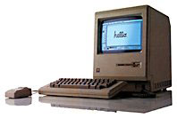
- The original compactMacs
- The Titanium G4 PowerBook
- The IIfx
- The Centris/Quadra610/Power Mac/Performa61XX
- The PowerBook 1400
2. Interesting, but not really pretty or elegant
- Color Classic
- iMac (except the FlowerPower and Blue Dalmatian)
- 500 series PowerBooks
- Blue and white G3/Power Mac G4
- WallStreet, Lombard, Pismo PowerBooks
- iBook
- PowerBook 5300/190
- Performa 6400/Power Mac 6500
3. Mediocre/boring - they can't really have been trying
- Performa 600/Centris/Quadra 650/Power Mac 7100
- Power Mac 7200-7600/BeigeG3
- The PowerMac 8000/9000 Series
- PowerBook 3400/original G3
- PowerBook 2400
- Power Mac/Performa 6200series
4.  Ugleee!
- iMac Flower Power and BlueDalmatian
- Original 100 seriesPowerBooks
- 500 series Macs andPerformas
- 5000 series Macs and Performas
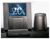
- The 20th Anniversary Macs
I don't doubt that there will be plenty of readers who willdisagree with my choices here, but that's the way I see it,according to my sense of style and taste, if not my buying history.Of the four workhorse Macs I've owned since 1992, one was fromcategory 1; two from category 2; and one from category 4.